FAQ
Click To Jump To The Item Below
It is always easier to create it correctly from the start than it is to fix it!
We get it – you’re excited to get your next print project going. You’ve decided to do the designing yourself, or maybe you’ve got a designer you like working with. That’s fine – RP&G is happy to print material that we didn’t design. We know your anxious to get started creating – but hold on –THIS IS IMPORTANT (note the all caps). Referring to this section before you begin designing can save us all a lot of time, stress and potentially money.
We have listed below a helpful guide on how to properly set up your art, highlighting the most common errors we see from files not set up properly. The biggest offenders are at the top in descending order:
Acceptable File types
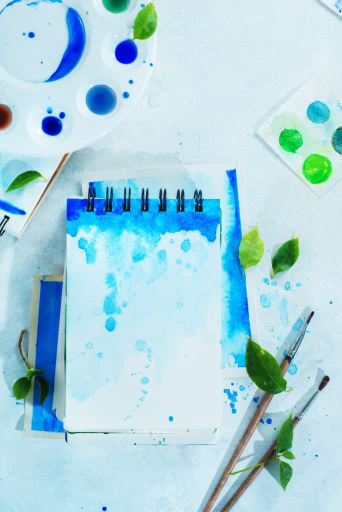
Files come in all types and sizes, so it is important to send us the correct one from the start so your project is not delayed, and your printing turns out exactly like you want!
Our preferred file type is a production-quality PDF, in CMYK color space, with a 1/8″ bleed on all 4 sides (if artwork goes all the way to the edge).
If you are not able to supply us with a production-quality PDF, the alternate would be a 300dpi JPEG, in CMYK color space, with an image size that allows for 1/8″ bleed to be trimmed off on all 4 sides.
If you are only able to provide us with native files (.ai, .psd, .indd, .idml), this will slow down the production time on your order.
#1 Problem - No Bleed Included In Art File
Bleeds – sounds like something your print job shouldn’t have – but they are really important to include!
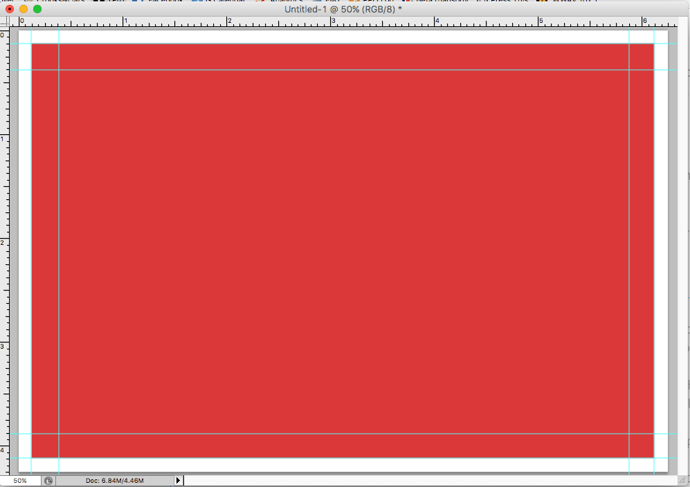
Bleed refers to an extra 1/8” (.125 in) of image or background color that extends beyond the trim area of your printing piece.
Any element that goes to the edge of the page is a bleed. Projects that have bleeds are printed on an oversized sheet that is then cut down to size with the appearance that the image is “bleeding” off the edge of the paper.
It is best practice to set up your bleeds at the very beginning of your project so you don’t have to adjust at the end. There are a few extra terms you must understand along with bleed are trim, safety, and borders.
- Trim Line: The final size of the document after the last cut is made
- Safety Margin: The safe area or inner margin in which to keep all important elements (such as logos and page numbers) within to prevent them from being trimmed off. This margin should be at least .1850” inside the edge of the trim line.
- Borders: All Framed Borders must be at least ¼” from the trim line or 3/8” from the bleed line.
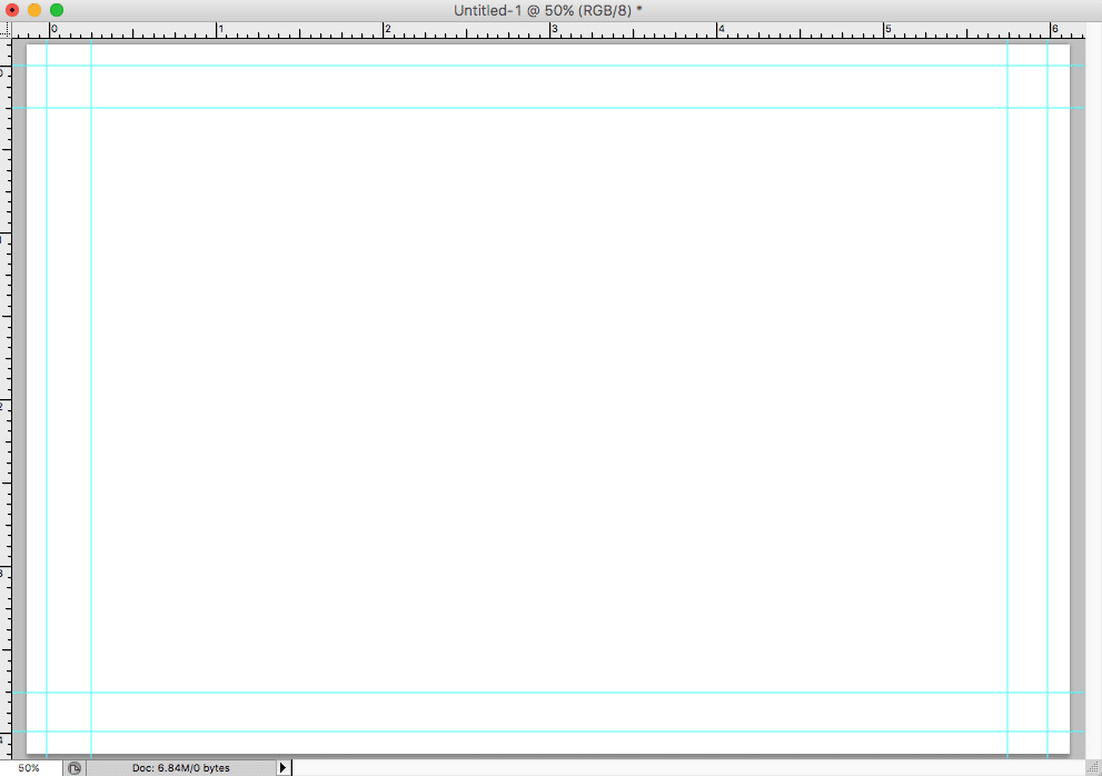
- InDesign: You can up set both bleed and margins in the “Document Setup” box when creating a new document. Simply bring your bleeds and margins up to 0.125 inches for top, bottom, inside, and outside. Your document will have visible lines for you upon creation.
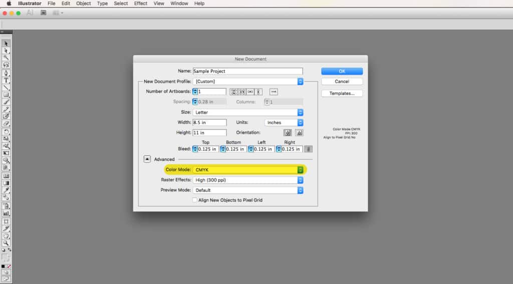
- Illustrator: In the initial “Document Setup” window, set your bleeds to 0.125 inches for both top, bottom, inside, and outside. You cannot set up margins in Illustrator, so you will have to use guides once your document is open.
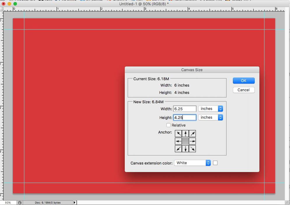
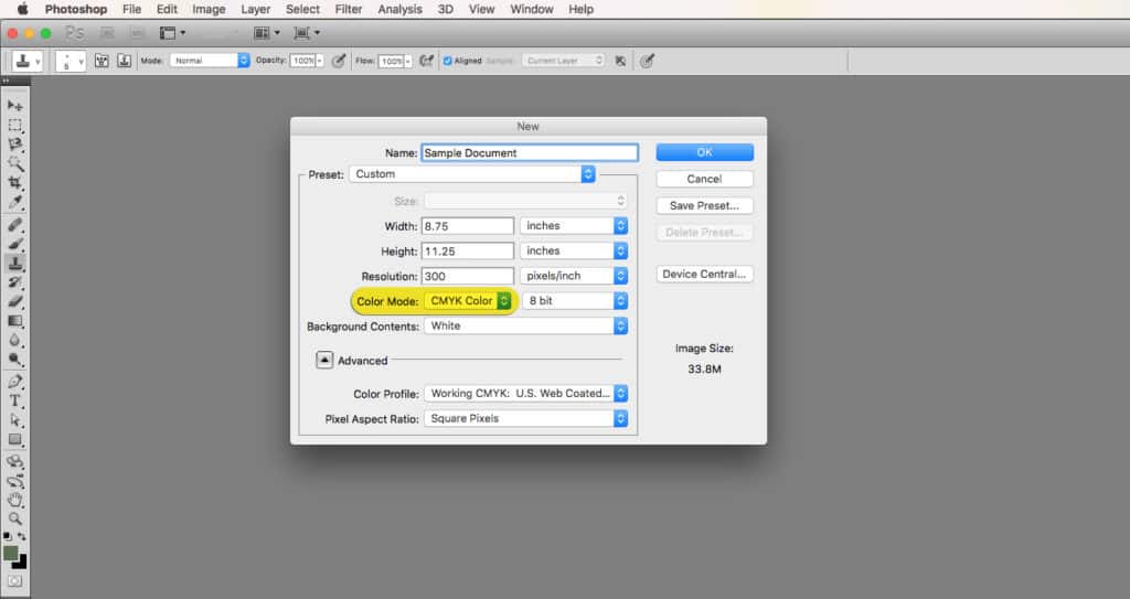
- Photoshop: This one can trip you up, but here is an easy recipe to follow: create your file at the final size (for example 4″ x 6″), then select all and fill with any color. Drag in guide lines for all 4 sides for your safe area – we recommend .25″, but you can get by with a minimum of .1850″. Now go to canvas size and add .25″ to each dimension (in this case 4.25″ x 6.25″) and select the add from center icons – click apply. Now drag in guides to the edges of the box made by the color fill you did. Reset your ruler by dragging in from hot corner to the guide corner of the color box. Finally – delete the color fill. you will now have a blank canvas with a set of guides showing the trim line and the safe area margin to keep type, logos and other important elements within.
- Publisher: Publisher is pretty similar to Photoshop when it comes to bleeds. To set your document up to bleed, simply add .25” to your document size in the Page Setup window.
- Word: Unfortunately, you cannot set up a full bleeding document in Word.
Safety Margain
As mentioned above, a safety margin is the space that you leave in between the final trim area and the image size area. This space ensures that after the product is trimmed, the content is not cut off or too close to the outer edges. A standard size margin is .25” on all four sides of the document (at minimum, we require .185″). The margin space will print, unlike the bleed, so make sure that the information that is contained in the margin is something that you want included.
If you place your content too close to the edge, it not only presents problems to us as the printer – it makes the viewers uneasy as well, as if the content is going to fall off the edge of the page!
Image Resolution
Getting a sharp image is so important when creating print material. Unfortunately, you can’t increase the quality of an image if it’s bad to begin with, which is why it is so important to set the resolution properly BEFORE you start designing!
Image Resolution is best understood as a rectangular grid of picture elements (pixels). Resolution is traditionally set in pixels per inch (ppi) also know as dots per inch (dpi). The more dots (of ink) that are printed per inch, the higher the resolution of the image – therefore the higher the quality in terms of sharpness and detail. You can always scale down in size, but never scale up; at least not without losing quality.
For an image to print properly, the image should be saved at 300 ppi at the final printed size. If you’re designing something that is going to be held in someone’s hand, such as a brochure or flyer, business card, postcard, etc. – this resolution is ideal.
For larger scale printing such as posters and banners, the image can be saved at 150 ppi at the final printed size. Viewing distance affects your required resolution in a number of ways, simply because if you stand further away from an image, the pixels seem smaller. This allows you to create your files at a lower resolution, while still keeping the file size manageable.
When in doubt, aim high! 300 dpi is the magic number!
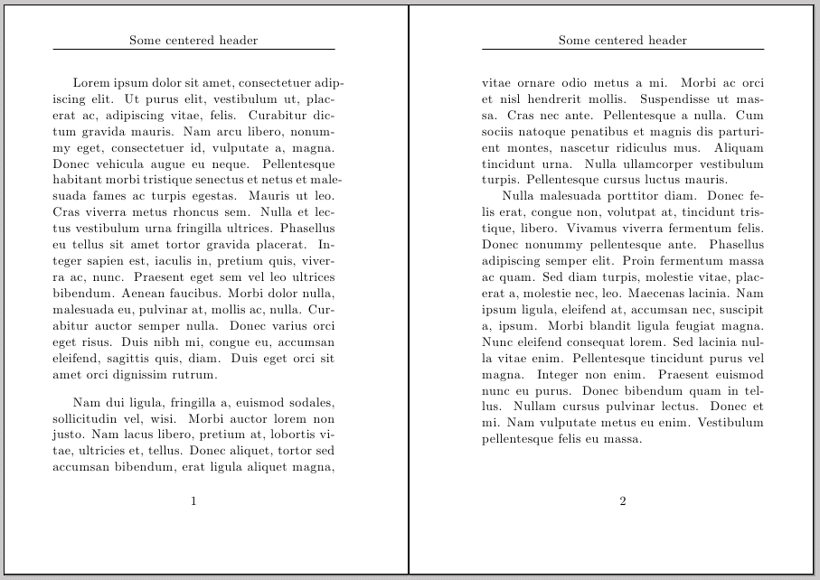
Page Numbers
Keep them centered on your pages to avoid headaches when paginating your booklets!
We often get client-supplied booklet art with page numbers that are set to be on the left or the right side of the page. Looks good in theory, but people often have odd number page counts, and don’t take into consideration that saddle-stitched booklets always need to be in multiples of 4. This requires us to add blank pages, which can throw off the left/right sequence. By putting your page numbers in the center bottom – you’ll never have a problem!
Borders
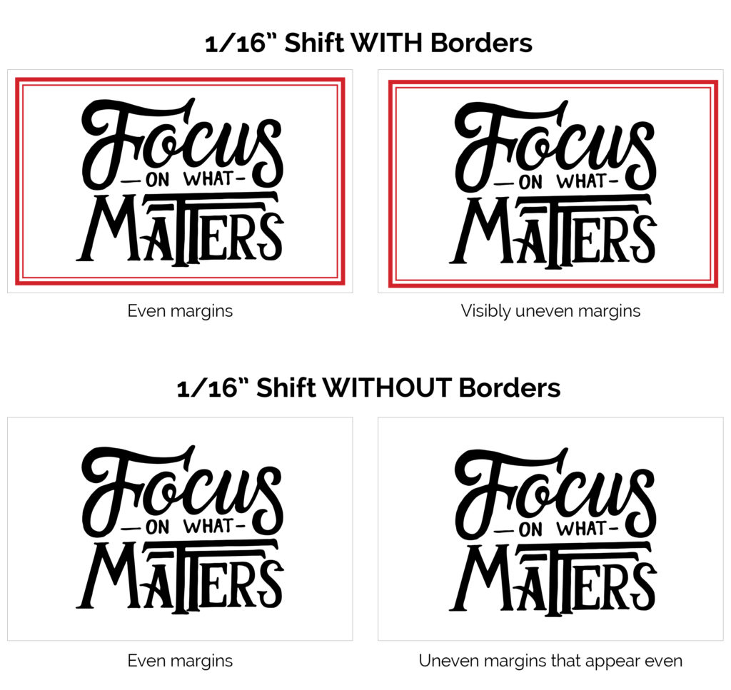
In the printing process, there is the potential of slight shifting (up to 1/16″ in any direction) of your elements from sheet to sheet. Therefore, if your border is very close to the trim edge, and there is any slight shifting, your border margins are going be noticeably uneven when trimmed out. Putting a border on your artwork is automatically something the eye is drawn to as a reference point, so it is highlighting the slight shifting even more so, when typically you would not notice it.
If you must use a border in your artwork, it is essential that your design allows at least .25 inches of white space from your border to the trim line to maintain a symmetric appearance as closely as possible.
Color Mode
Scanners, digital cameras and computer monitors use red, green and blue (RGB) light to display color.
Commercial printing presses print with cyan, magenta, yellow and black (CMYK) ink, called process printing, and therefore produce a different range of colors. The combination of RGB light creates white, while the combination of CMYK inks creates black. Therefore, it is impossible for the printing press to reproduce colors exactly as we see them on our screens.
Certain RGB colors that you can see on your screen (specifically bright blue, green and red) cannot be replicated with standard CMYK inks.
RGB Color Mode
CMYK Color Mode
Many programs have the capability to convert the layout/images from the RGB color space to the CMYK color space. We request that you convert your colors from RGB to CMYK if your tools allow you to. By doing it yourself, you have maximum control over the results. You may notice a shift in color when converting from RGB to CMYK. If you do not like the appearance in CMYK, we recommend that you make adjustments while working in CMYK.
EVEN BETTER – make sure when you start designing, you are working in CMYK mode, and that all of your photos/assets have been saved in CMYK color space.
ADOBE PHOTOSHOP
ADOBE ILLUSTRATOR
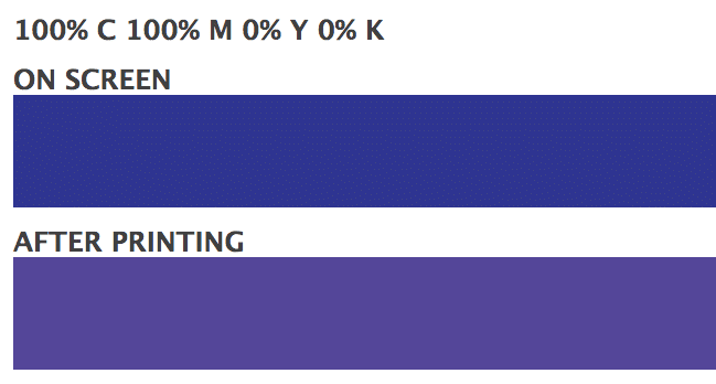
Blue Color Value For Printing
When using a blue in your design, always make sure to leave at least a 30% difference in your Cyan and Magenta values.
Blue is close to purple in the CMYK spectrum. Make sure to use a low amount of magenta whenever using high amounts of cyan to avoid your colors looking purple!
EXAMPLE: C-100 M-70 Y-0 K-0
Logo 101
**IMPORTANT!** RP&G will charge a library retrieval fee of $18.50 after the second request to send logo files. Please read on below for proper logo file organization and storage suggestions!
A note about AI and EPS files: Oftentimes, people think that these files are “broken”. Here is what is going on:
EPS and AI files are graphics files that require certain professional graphics software to open or use. When you don’t have the software installed, the icon of the file doesn’t have anything to reference it to, and can appear as just an empty box. When people try to open it to see what it is, nothing happens because your computer doesn’t know what to do with it, because you don’t have the software. A lot of people then delete it because they think it’s broken or corrupt, but it is fine. When you send it to your sign guy, vehicle wrap person or printer, they have the necessary software, and it is exactly what they need to produce your logo at any size without loss of quality.
In other words, these files are GOLD – hold on to them and store them in a safe place!
Check Your Measurements With Us First!
If you’re designing your own print material, be sure to check with the RP&G team on the intended finished size before you get started!
In order to get you the best possible pricing, we often run your print material multiple up on a sheet. Sometimes, 1/4″ can make all the difference in your pricing – potentially doubling it!
Having the conversation with RP&G first will allow you to design with the necessary knowledge and foresight, and get you or your customer the best bang-for-the-buck!
Design Tips
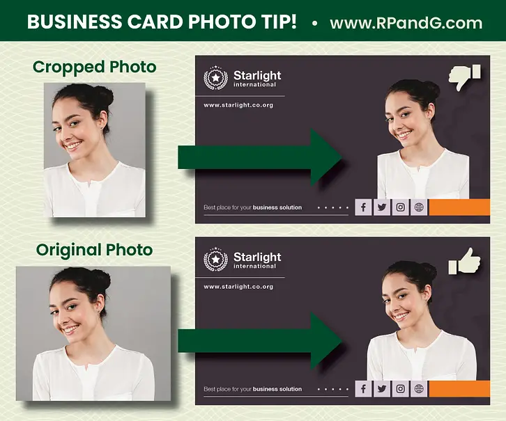
When you plan to use a headshot for your business cards, be sure that your photographer can provide you with an uncropped version that does not cut off your shoulders. This is especially important in examples such as this one, where the photo is silhouetted on the card (meaning the background is removed from the photo). You will see in the cropped example that the woman’s shoulders cut off abruptly, which makes for an awkward silhouette on her business cards.
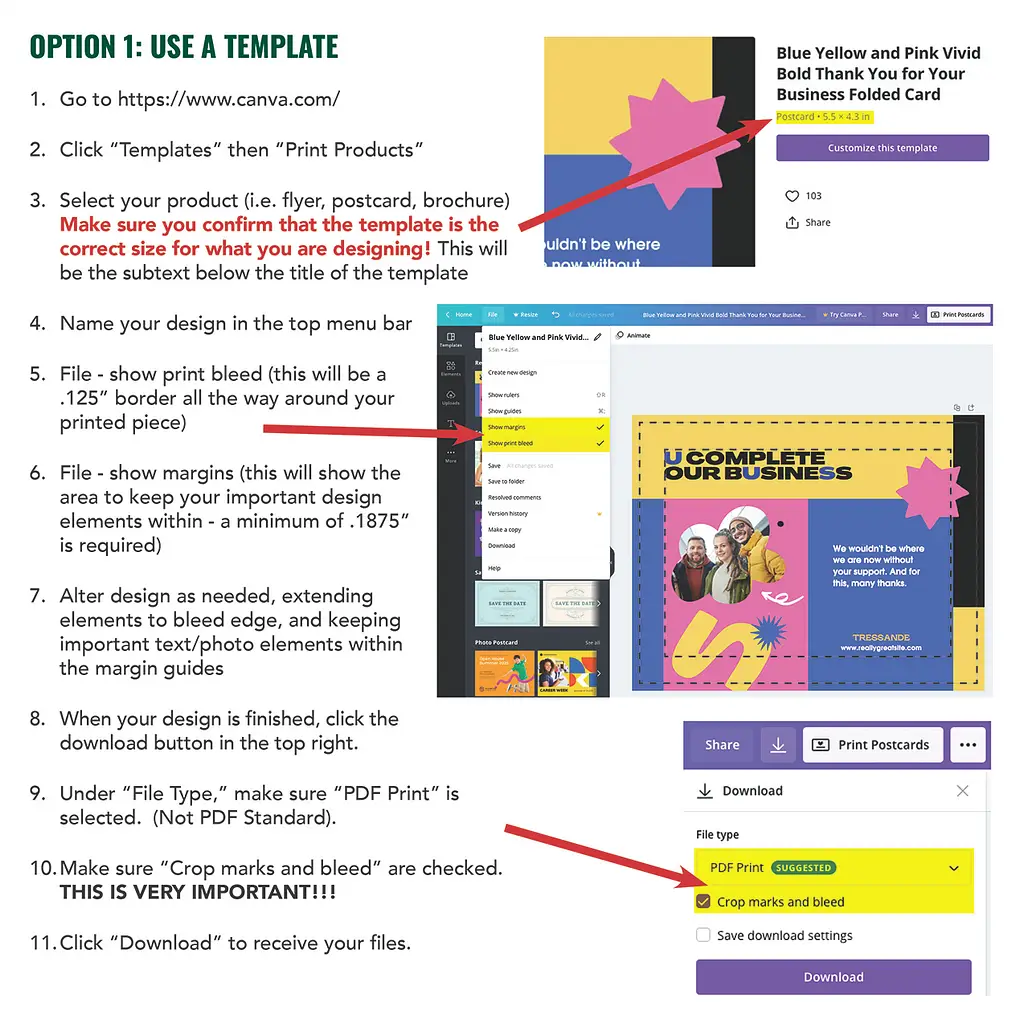
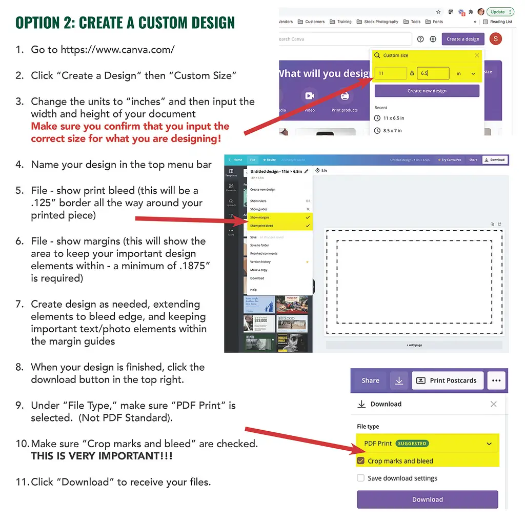
Designing in Canva
***IMPORTANT*** if you are using a free canva account, you cannot change the size after you start designing, so make sure you have the size correct before you start!
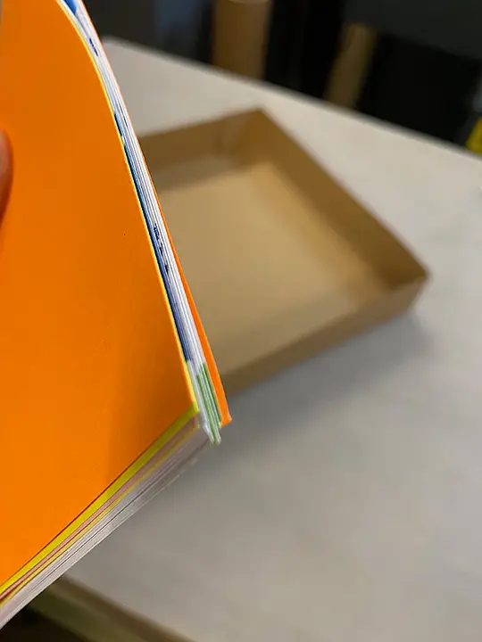
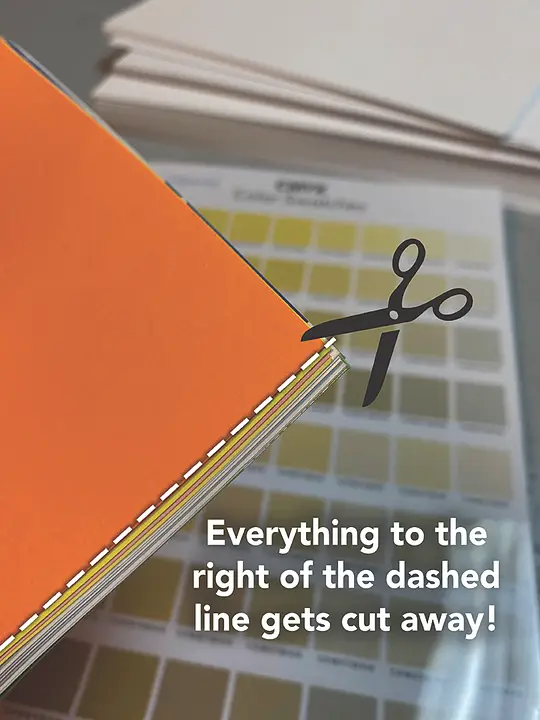
Creep in Saddle-Stitched Booklets
If you’re printing saddle-stitched booklets that have anything over 12 pages, you’ll need to allow for creep in your document.
Creep is the technical name for what happens when you fold a stack of pages together; the outer pages appear shorter as they wrap around the large inner bulk. Because of this, the inner pages stick out slightly. When they are trimmed by us to give a nice, straight document edge, anything that is printed over this trim line, like text or page numbers, will be cut away or into.
The easiest way to plan for this is to keep all important text and items in from the edge a minimum of .25” and .33″ from the outside edge if you can manage it.